We’ve all been there before. You’re in a store, flipping through a stack of sweaters (or ties or jackets or whatever it may be), and you can’t decide between the dozen or more color options. Or maybe you’re diving into your closet in the morning, frustrated that you can’t find the right match for that bicycle yellow or cadet blue parka.
When it comes to men’s style, coordinating colors can be as simple or complicated as you want it to be. There’s a lot already written on the subject, but much of it gets too deep into the thickets – missing what I think are the broader points that stick in men’s minds. So I thought I’d be build a basic PTO primer, with some details woven in, on how to think about color in men’s style.
Color as Social Language
Here’s the problem with most things written on this subject: writers often forget that clothes aren’t like anything else. We’ve written a lot in the past about how clothes are a form of social language – they represent who we are, how we feel, and where we fit into society. You can’t just transplant whatever you’ve read in an art theory book and indiscriminately apply it to clothing. Fashion isn’t like any other art form (to the degree it can be considered art), and choosing colors for an outfit isn’t at all like how an artist chooses color for a painting.
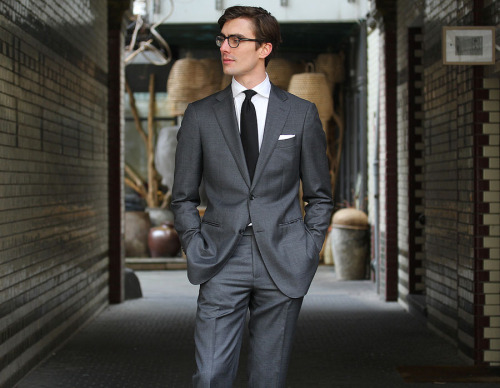
Take the most obvious example: the standard business suit. In its most basic and serious form, it involves a dark suit, white shirt, dark tie, and neatly folded, white linen pocket square. Shoes can be either black or dark brown, although in some circles, black is really the only choice.
There are ways to play around with this outfit, but if you want to send an unmistakable message that you’re here for business, you’ll stick to this formula. Substitute the white shirt out for pink, and suddenly the suit means something different. Drop the white pocket square for yellow or navy, and the message isn’t the same.
You can see this uniform above on Niels in Berlin, or in a countless number of movies where the director wanted to signal something about a character. The dark suit with a white shirt and dark tie has a very specific social meaning that’s not just about color theory. It’s a stylistic representation about certain activities, identities, and attitudes – a standard bearer for the modern business uniform.
Social language isn’t just in traditional clothing; it’s everywhere. Much of what we have in casualwear today derives from workwear worn in the early- to mid-20th century. That includes everything from jeans to mountain parkas to bomber jackets. (See Bruce Boyer’s Rebel Style for a nice essay about this subject).
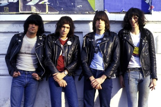
There are lots of archetypes here. Your basic white fitted tee with blue jeans is the baseline for a lot of American rebel looks, thanks partly to James Dean. Throw on a black leather jacket and you have Marlon Brando in The Wild Ones. Few people who dress this way today remember those characters, of course, but they take inspiration from people who do – Sid Vicious or The Ramones, for example. Or even Kanye West, who has revived a bit of old rocker style today.
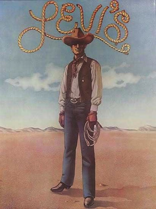
Similarly, faded blue jeans look great with dusty brown leather boots not because blue and brown go well together (although they do), but because they symbolize something very specific: the mythologized American cowboy and start of the American West, which is laden with our ideas about masculinity and independence. Likewise, military-inspired looks rely heavily on colors such as olive green, tan, and black for no other reason than the fact they’re used in the military.
In this sense, choosing colors for an outfit isn’t just about choosing things that look nice next to each other. It’s about understanding broader aesthetic traditions and knowing how to speak a language. Back in the 1950s, Noam Chomsky famously put forward “colorless green ideas sleep furiously” as an example of how a sentence can be grammatically correct, but semantically nonsensical. Much like words in a sentence, meaningfully combining colors in an outfit can also require knowing something about how colors have been used in the past.
Unfortunately, there’s no shortcut to this – you just have to pay attention to how certain groups dress, both in historical and contemporary terms. Luckily, most people pick it up in short time, even if they’re not conscious of it. The key here is to remember that swapping out colors in an outfit isn’t like choosing a different color for a painting. Sometimes it’s like choosing a different word in a sentence.
Color as Emotional Language
Related to the idea of social language, there’s also a very rich emotional language in colors.
Take black, for instance. Historically, it’s come to mean all sorts of things. It’s the color of seriousness and somberness, thanks to the Victorians, but also of humility and discretion, thanks to certain ascetic religious groups (e.g. Orthodox Jews and The Quakers). At the same time, black also symbolizes evil (think: witches and motorcycle gangs).
Fashion designers sometimes use black to communicate those emotional values. Rick Owens and Yohji Yamamoto, for example, are famous for how they use the color to create a sort of cold, stand-off-ish attitude. In an all-too-often cited quote, Yamamoto once summed it up nicely: “Black is modest and arrogant at the same time. Black is lazy and easy, but mysterious. But above all black says this: ‘I don’t bother you, don’t bother me.’” Guys who wear those lines rely on white and grey for their other pieces, largely because they underscore the power of black.
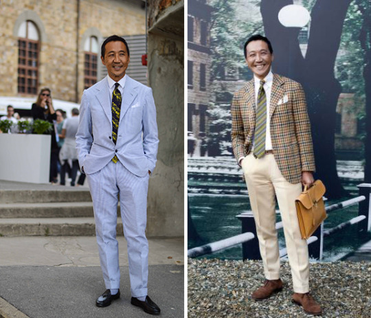
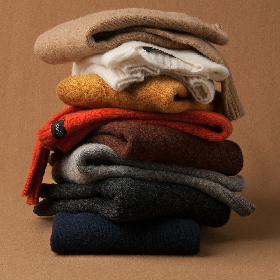
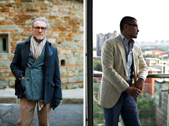
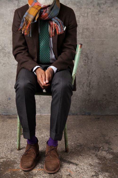
Almost every color has some emotional power. The easiest way to think about this is through seasons. Spring and summer wardrobes often rely on brighter, lighter colors to convey a cheerier mood. See Yasuto Kamoshita above in his sunflower yellows, bright whites, and spring blues. On the other hand, darker, more somber colors are often better suited for fall and winter. See the third photo above, taken from Drake’s, which shows how Loden green and warm browns can be used for a more autumnal look.
Once you understand the emotional power of colors, you can use them to suit your mood and certain activities. A brown linen suit, for example, can be great for a fun day out in the city – something to wear while hanging out a swanky cafe or having brunch with friends. Once nightfall hits, however, you may be better in a worsted wool navy suit or even a black velvet sport coat. Those will feel chicer than brown linen.
Color as Artistic Language
Of course, color isn’t about just emotional and social language. There’s the more obvious and intuitive dimension: how something looks, purely as a visual medium. Those interested in this subject can explore Josef Albers’ Interaction of Color, one of the more seminal texts on this subject, along with this iPad app. That deals with color in a broader sense, but here are some ideas on how to use color creatively for a wardrobe.
Stick to Basics
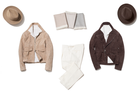
The simplest and easiest way to deal with color is to stick to the basics. That means grey, brown, and blue for your major pieces, in varying shades depending on the item. Olive green is also useful for casualwear, such as field jackets and chinos, but the other three are great for the backbone of your wardrobe.
The upside to these three colors is that they play well with each other and they’re easy to wear. You can grab almost anything out your wardrobe in these colors and be assured they work – blue jeans with a brown leather jacket, or a blue blazer with grey trousers. Save slightly more unusual colors, such as burgundy or orange, for your accessories.
This might sound boring at first, but remember that you can always differentiate your outfits by their fit, silhouette, and subtle details. You don’t have to dress loudly to dress well, which is why sticking to basic colors is so useful. Best example of how to dress well using simple colors: our pal Graeme in Sydney, Australia.
Matching and Complementing
When you’re playing outside of your standard colors, you’ll want to start thinking about the color wheel. Colors across from each other, or adjacent to one another, typically go best together. The most basic color wheel deals with primary colors, but you can vary things by hue, saturation, and value and get the same principles (see this reference guide).
Once you understand what colors go well together, you have a choice between complementing and matching. And most of the time, at least when it comes to men’s dress, you’re better off with the first. This is partly because you always want some contrast between your items (see section below), and partly because overly match-y outfits can look affected.
When complementing colors, consider the primary and secondary colors in your outfit. Sometimes you’ll want to highlight a significant color, such as a sandy tan leather jacket; other times you’ll want to pull out a subtle color somewhere (such as using a burgundy pocket square to highlight a burgundy stripe a tie). Again, the key is to look put together without seeming overly coordinated.
For some great examples of how to use color in a more modern and creative way, explore Stoffa’s lookbooks and blog posts. The owner and designer behind the label, Agyesh Madan, is a master of this stuff.
Think About Contrast
Key to any outfit is contrast, and you always want some between your pieces (unless, like a suit, they’re purposefully made to match). Most of the time, contrast will come from color. That means your jacket should be in a different color than your trousers, and your trousers in a different color from your shoes (even if it’s just varying shades or hues). The one exception: socks, where you sometimes want them to match your tailored trousers.
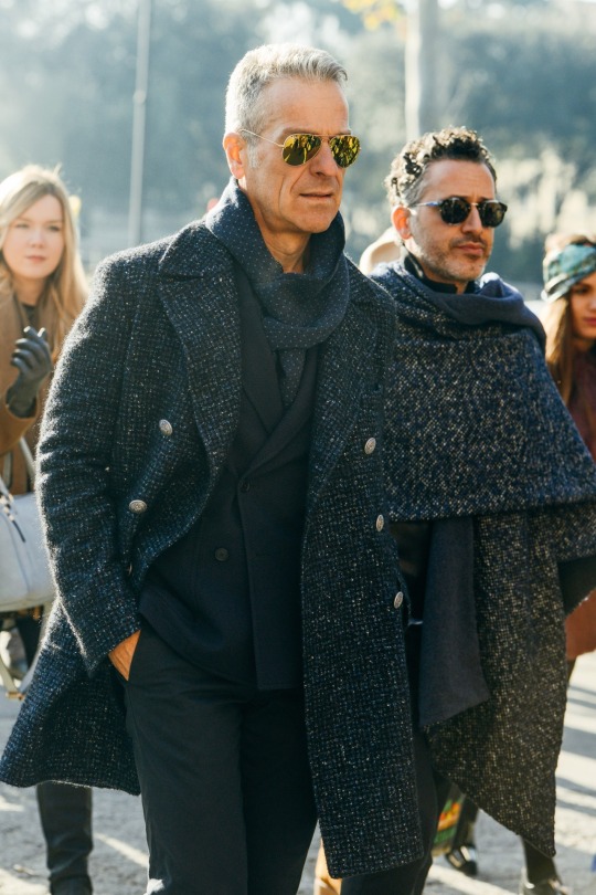
There are different ways to get contrast, however. Along with color, there’s also pattern, texture, weave, and sheen. For a more “advanced” move, try low-contrast outfits that play within a narrow color range. A black leather jacket, for example, looks great with black denim, largely because the two items have very different kinds of texture and sheen. Similarly, Tony Tanfani looks great in an all-charcoal outfit above because he’s able to vary things using patterns and weaves.
Low contrast outfits are a little easier with casualwear than traditional clothing, but here’s a trick to getting a low-contrast outfit to work with a sport coat: when all else fails, opt for a saturated blue shirt (particularly if you’re using a lighter colored jacket and pair of trousers). Darker shirts won’t work with a tie, but they’ll help “anchor” the lighter colors and pull everything together.
Using Louder Colors
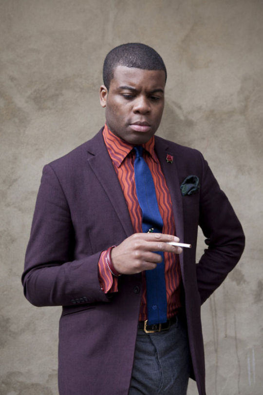
Sometimes an unusual color, such as purple or red, can be a great way to add a playful accent or create a bolder outfit. Note, there’s a fine line here between using a louder color successfully and relying on gimmicks. Colorful “fun socks,” for example, all too often ruin what would have otherwise been a nice ensemble (please, no more bright red socks with navy business suits). At the same time, an orange scarf can add a nice, autumnal touch to a brown tweed or waxed cotton Barbour.
It’s harder to use loud colors for major items, such as jackets and trousers, but it can be done. Most of the time, they require a masterful understanding of aesthetic traditions. See our friend Barima in London, who does these sorts of looks well. His style is perhaps more ‘60s Peacock Revolution or “London Mod on acid” than it is just about loud colors. The mistake some guys make is assuming they can just throw a crazy jacket over a pair of grey trousers and be stylish (no, it’s not just about confidence). Using loud colors well for larger items requires a lot more thought and coordination. Browse through some of the young British looks during the ‘60s and ‘70s for inspiration (e.g. Granny Takes a Trip and the swinging London scene).
The Takeaways
There are lots of ways to think about color in men’s fashion, but the important thing to keep in mind that it has social and emotional content – not just artistic. When choosing colors for yourself, think about how you’ll be using the item. You’re almost always safe with grey, navy, and brown for most items, but if you’re looking to explore a little, consider color theory – which colors play well together, how to achieve contrast, and where loud pieces can work. Then consider the emotional and social messages you’re trying to create. Maybe it’s a damp and cold autumn day, and you’ve decided to wear a green Barbour jacket. In that case, muddy browns, deep burgundies, and burnt oranges might be useful. Or maybe you’re getting dressed for a business meeting, in which case you’ll want traditionally “city” colors such as black, white, and navy.
Of course, the only real rule is to look great. The above is meant to be a friendly guideline on how to think about color, not hard written laws. At the end of the day, you should dress according to your eye.
(photos via Unionmade, Shibumi, Levis, Mr. Porter, Monocle, Drake’s, Guido Wongolini, The Sartorialist, Beijing1980, Stoffa, and Barima-Edusei Owusu-Nyantekyi)