

Deciding on whether any particular combination of colors in an ensemble works or not is probably best left to on-the-spot judgment. Style is, after all, still more of an art than a science, despite all of its rules and regulations. Nonetheless, I use a few rules of thumb myself and I thought I’d share them here.
First, you can always rely on the color wheel. A safe approach is to combine colors that sit next to each other. For example, two tones of blue can easily be paired with a navy suit, and a dark brown jacket can be worn with khaki chinos. These should be done with some care, however, as you also want to strike some level of contrast. Colors too close in tone can look odd when placed next to each other.
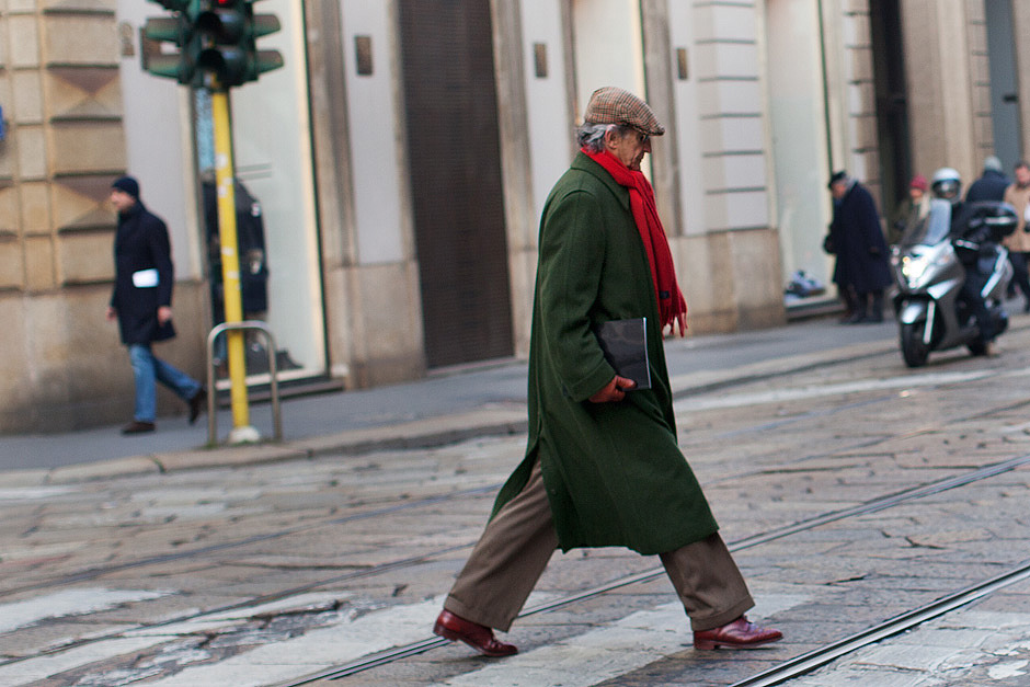
A more daring approach is to team up colors on opposite sides of the color wheel. Blue and orange, for example, are quite good so long as you keep the orange to a minimum, as are green and red. In this way, you can balance the warmth and coolness of your colors as well.
Second, you can rely on the classic combinations. Blues, greys, and browns will always look good together. I also find grey and green to be nice, but for some reason not navy and green. (As the saying goes: “blue and green should never be seen without a color in between.”). Some may find these combinations to be a bit too unimaginative, but you can always make them more interesting by finding more unique values or saturations. For example, as I wrote in this post, something such as a slate blue sweater can work very well with dove grey chinos. Blue and grey don’t have to be boring.
Third, you may want to think about colors as groups. These groups can be seasonal (e.g. wearing burgundies, rusts, and browns in autumn) or associated with certain “looks.” A more country ensemble, for example, should rely on earthy or plant-based colors, such as moss green or lilac purple. Business attire should draw on traditional shades of navy, brown, and grey, while a more casual, preppy ensemble may have muted shades of khaki and light blue with spots of bright colors.
Of course, in the end, you should just judge these things based on your own eye. To me, the easiest is usually finding some contrast between pieces and balancing your warm and cool colors. If you can express the time of day, season, or weather through your palette, all the better.
(Photos from The Sartorialist)