A running theme in how I’d like to dress, vs how I actually dress, is more use of items that don’t match but use the same tones. I’m not a master of color theory, but I like the idea of using one basic hue, and complementing it with other tones in the same family, lightened or darkened, in a mix of textures/patterns. According to color theory, that creates character and maintains unity. Character and unity: basically my motto.
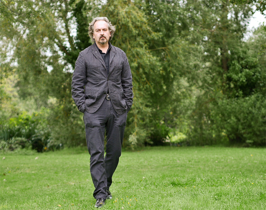
Richard in Faversham does this extraordinarily well. In the photo above (against an appropriately tonal green background!) Richard wears a gray/black houndstooth “suit” with a black button front shirt, and black brogues. On paper, that sounds problematic–like a reformed 90s mall goth going to his office job. But Richard proves it can work–I don’t think a white or blue OCBD would improve the ensemble above in the slightest, and a blue OCBD is the greatest shirt of all time. The textures and shapes are “country” or beyond (casual cotton (not without wrinkles), houndstooth, fatigue cut trousers) but the suit would make a good rus in urbe fit in New York or London as well, thanks in part to its dark palette.
Most of the workable tonally consistent looks are darker and always restrained in color: dusty olives, washed blacks, beiges–you could dress in head to toe orange-family tones but, unless you’re hunting, I wouldn’t.
–Pete