Contrast is one of the bedrocks of traditional men’s clothing, and one of the easiest ways of selecting what pieces look good together, to most people. It helps that a lot of men’s clothing archetypes work with contrast, and that trains our eye to like a “dark jacket, light shirt, dark tie” palette. Trad: Navy blazer, OCBD, repp tie. Connery’s Bond: Charcoal suit, white shirt, dark grenadine tie. Likewise, casually, Brando/Ramones: white tshirt, black leather jacket.
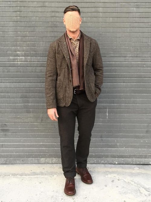
I’ve said before that combining similar color tones can be tricky—not all black tones are complementary, for example. But Mike in Los Angeles does tonal dressing justice in the autumnal photo above (not that LA gets much autumn). In shades ranging from burnt sienna to khaki, he wears six items that could all be described as “brown,” but rather than looking muddled, they harmonize together quite well. He also wears trousers in a darker shade than his jacket, another choice with a moderately high degree of difficulty. Two things that make tonally uniform ensembles easier: varying textures and moderate cuts. Although Mike’s jacket is shorter than a comparable tailored jacket, nothing is cropped, tight, oversized, or exaggerated. The point of distinction, as Jesse might call it, is primarily in the color and texture of the items.
-Pete