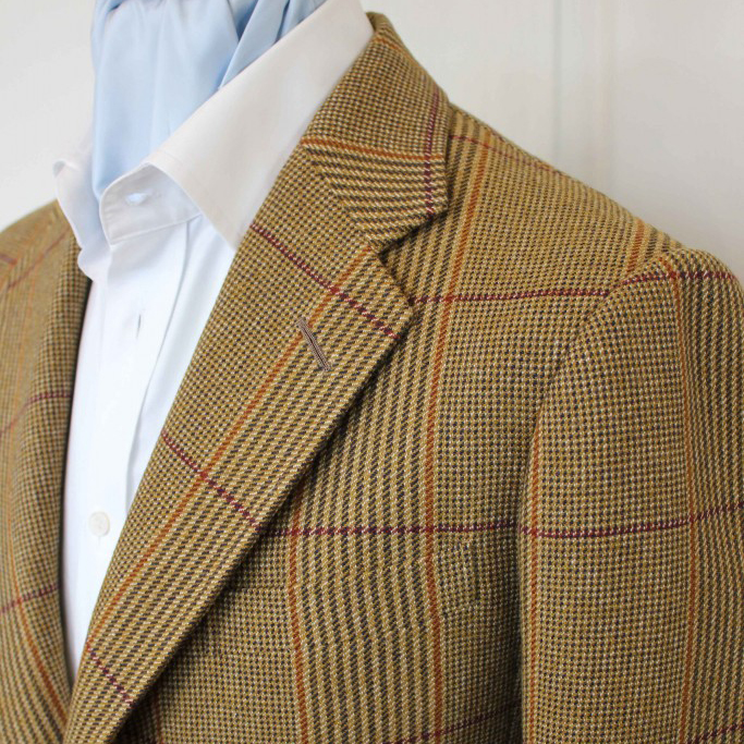
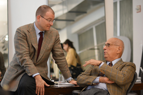
A few years ago, I commissioned a custom sport coat from Steed Tailors. The coat is inspired by an iconic photo of George Fraizer, the American writer who penned “The Art of Wearing Clothes,” arguably the best essay ever written about men’s style. In the photo, Frazier is shown wearing a button-down collar, dotted tie, and Russell plaid tweed suit. You can tell it’s a suit because of his button configuration. Sport coats typically have a fewer number of cuff buttons.
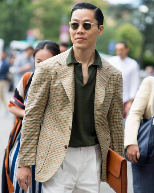
Russell plaid is one of those patterns you rarely see anymore, but it’s a classic check. It’s like a large scale glen plaid, except the horizontal sections of the check have been stripped away so that only the vertical lines dominate. For the lateral parts, there are just thin stripes, which are typically done in dark brown, burgundy, or rust orange. Those colors complement the ground of the fabric, which usually ranges from pale wheat to golden tan. (I choose the golden tan version).
These seem like the perfect colors for a fall/ winter sport coat, but truthfully, after having owned the jacket for a few years, I rarely ever wore it. Then one day, it dawned on me why: I don’t have the right pants. Frazier got his Russell plaid done up as a suit, but as a sport coat, I had to think harder about color temperature. Some colors run warm; others are cool. Where your jacket and trouser combination isn’t a forgone conclusion, as it would be with a suit, you have to think about how a color visually “feels.”


Neutral Tan
Every color has a temperature, but let’s focus on tan to make this simpler. The photos above show some tan suits. The tan here is pretty neutral — neither warm nor cool. It sits in the middle of the road like a spring day. This is the hue you probably imagine when you hear the word tan.
Warm Tan
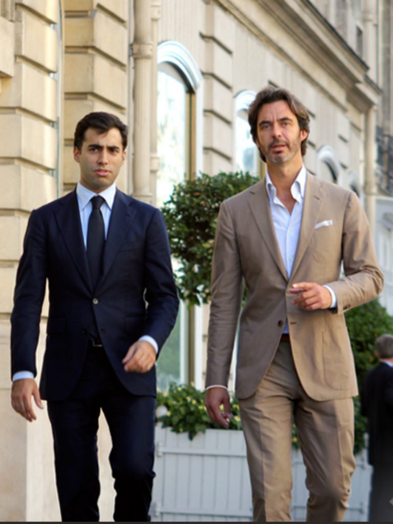
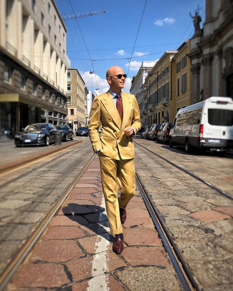
Now, let’s add some yellow to it. Suddenly, the color becomes brighter, stronger, and, most importantly, warmer. Luca Rubinacci often posts photos of himself on Instagram wearing the radiant tan double-breasted suit you see above. Notice how he chooses his accessories: the rust-colored tie and burgundy colored shoes. You can wear a cooler brown in these instances or even a cool navy tie, but his choice in warm-colored accessories shows he gets this concept. Everything is visually strong.
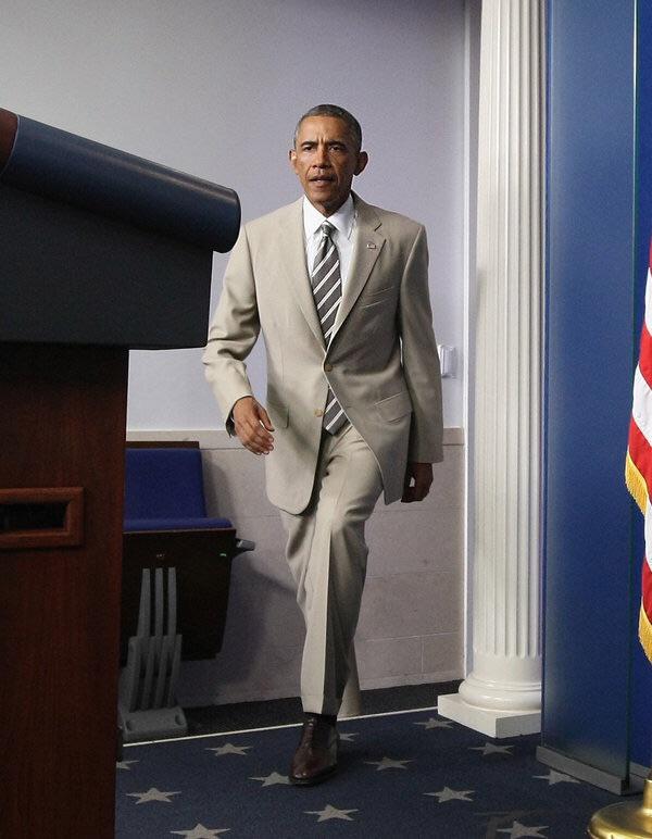
Cool Tan
Here’s Obama in his infamous tan suit. Notice here, the tan feels very cold, almost like a pale grey. The color is colder than the neutral tan we posted in the first set of examples and certainly colder than the bright, goldenrod suit Luca Rubinacci is sporting. Like Luca, Obama is wearing accessories that match his suit — a cold, taupe-colored tie and dark brown shoes.
Pairing Color Temperatures
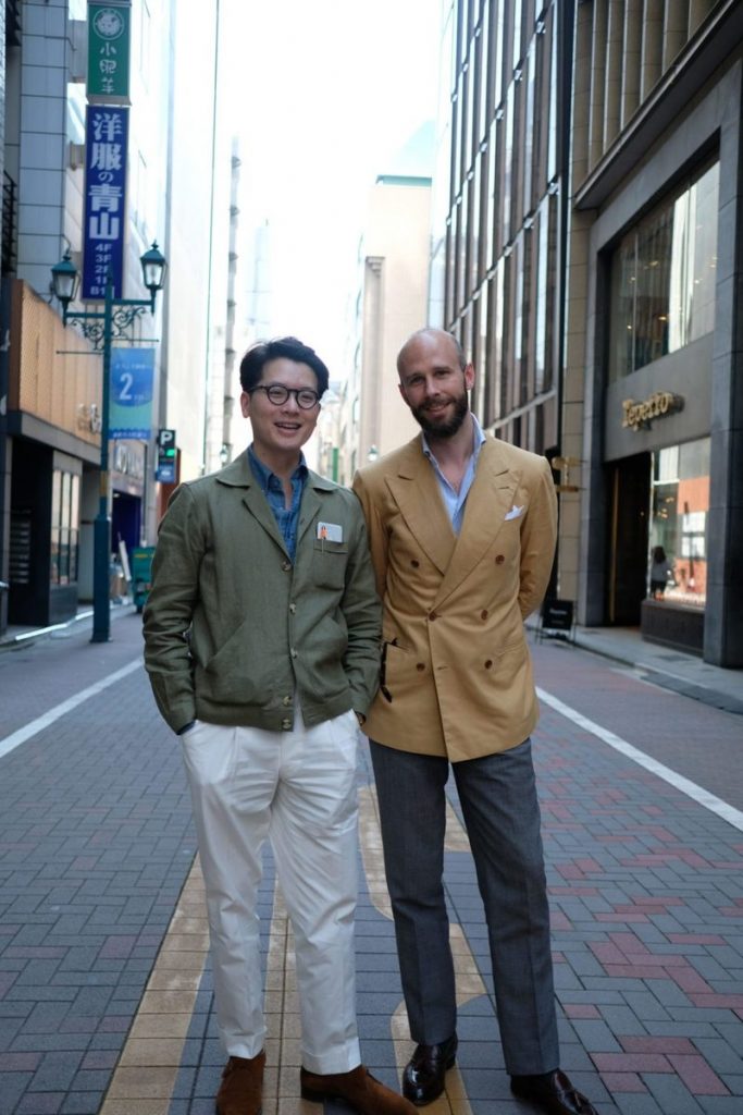
You can add visual interest to an outfit by adding accessories in contrasting temperatures. A warm, gold-colored pocket square, for example, can look fantastic with a navy suit. Similarly, cool navy ties go with anything, including warm-colored suits. But generally, you want your jacket and trousers to match in terms of color temperature. Simon Crompton, who’s always impeccably dressed, can be seen above wearing a warm-colored double-breasted coat with grey trousers. Simon still looks excellent here, but the outfit could probably be improved if he were wearing Mark’s white pants or something warmer (say a lighter shade of khaki with a similar yellow cast).
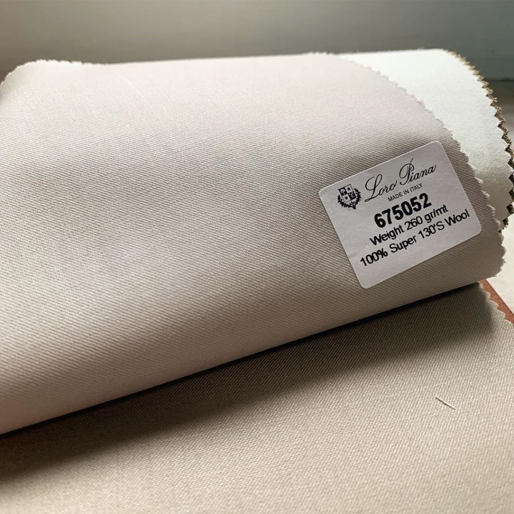
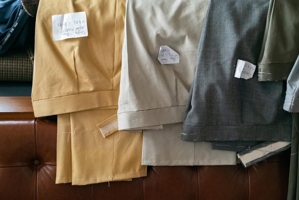
You can sense temperature more clearly when fabrics are placed next to each other. The Loro Piana fabric book above shows three varying shades of tan, going from darkest on the bottom to the brightest in the third swatch at the back. But you can also see how the colors start to feel warmer. The middle swatch almost has a slightly red undertone.
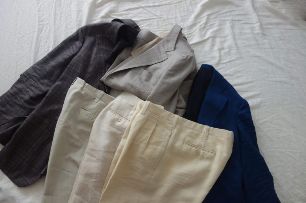
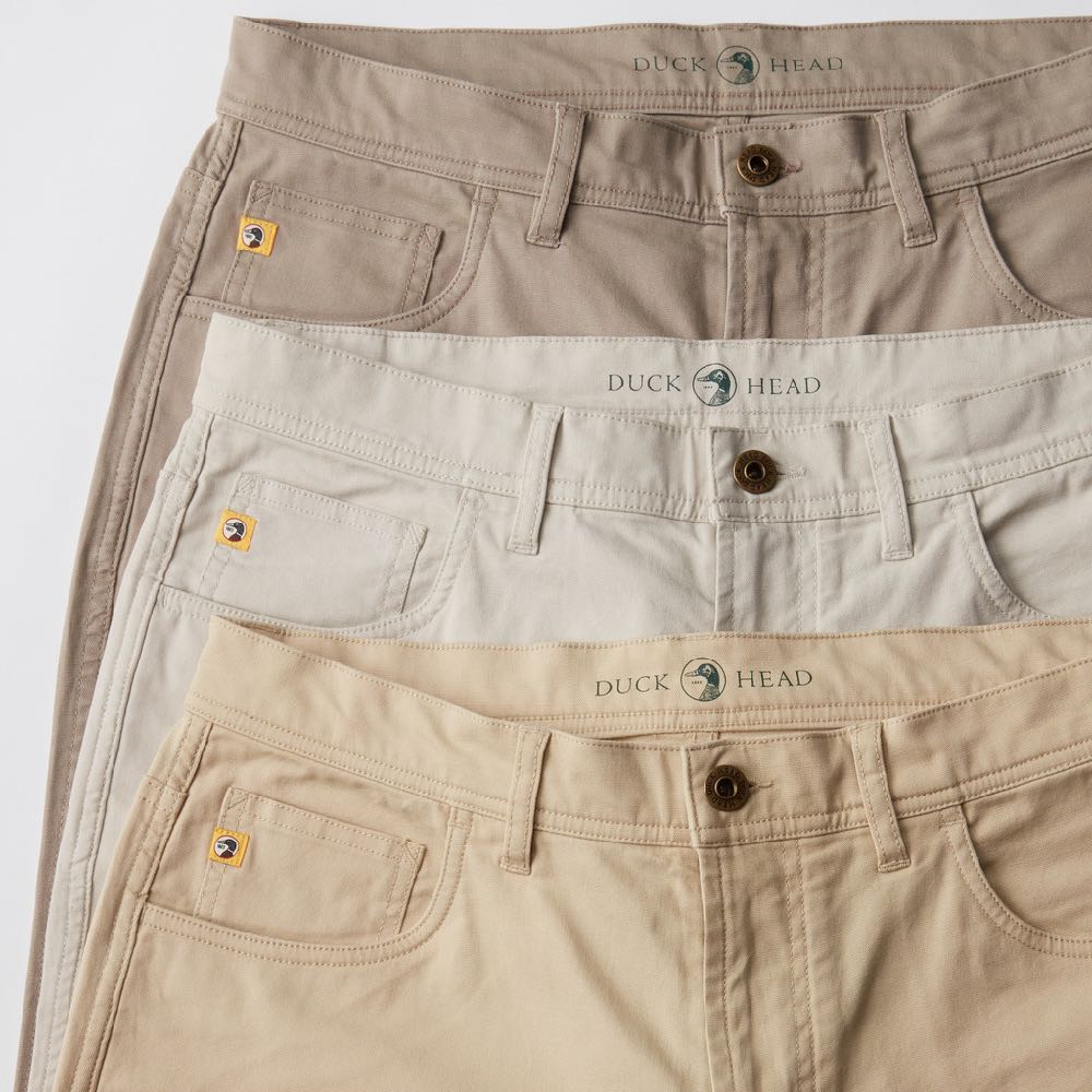
In the second photo, David Isle at No Man Walks Alone shows how three different shades of off-white can be used to support different kinds of sport coats. They plug into each other like correctly set Legos — switch the positions of the taupe and blue sport coats, and the combinations wouldn’t work as well.“The photo shows what I would consider the three different kinds of off-white: grayish-white, brownish-white, and yellowish-white,” David writes. “The most useful off-white shade to have is brownish-white – what I would call ‘natural,’ the color of undyed linen. You can see it in the middle of the photo above. This is a just-right happy medium between the too-warm color of yellowish-white and too-cool color of grayish-white. If you were to get only one pair of linen trousers, you would want these.”
The yellowish trousers are the least versatile, partly because their yellowness draws too much attention. To make the pants work, you need a coat that’s vibrant enough to hold its own. This can be done in bright colors, such as David has here with a bright blue jacket. Or a ruddy, warm color, such as rust. Finally, the greyish-white trousers on the far left, what retailers sometimes refer to as “stone,” are a natural complement to cool navy and taupe brown.
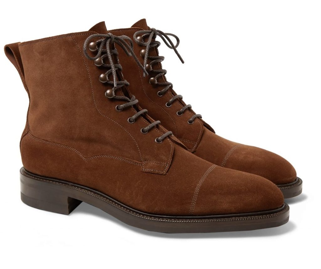
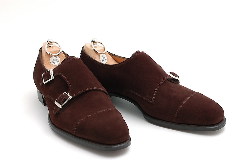
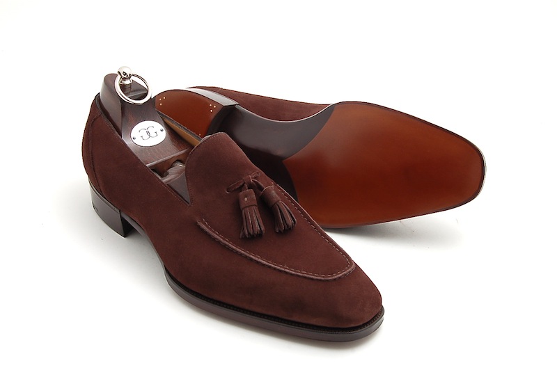
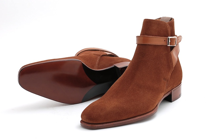
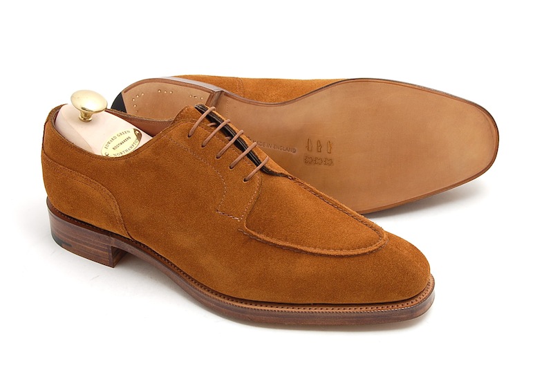


This concept works in other ways. Brown shoes are famous for this because, if the temperature is slightly off, they sometimes don’t match as well to certain outfits. The brown suede boots in the first photo are relatively neutral, and consequently will be the easiest to wear in terms of color. But the other images show how mid-brown suede can have red or yellow undertones, which make them feel brighter or warmer. Dark burgundy shoes can look great with navy suits because there’s a social convention for that pairing. But certain red hues can be more difficult because most men don’t have the trousers or coats necessary to support such a warm color.
There aren’t any hard and fast rules for this. Sometimes a warmer shade of tan can work with grey trousers. Sometimes you need something stronger. Your best bet is always just to develop your eye. Next time you’re at the store, take a look through just the selection of dark blue fabrics — some will have a purple undertone, which makes them feel warmer, while others will be a truer and cooler blue. Once you pay attention to color temperature, you can figure out why a particular combination may not look right and where you can turn to improve.
