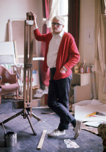


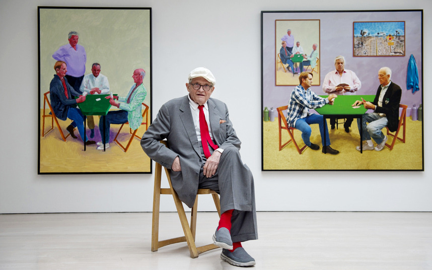
You can steal wholesale from some style icons: McQueen’s sweatshirts, Dean’s jeans, Connery’s suits. But from others, you only hope to borrow a vibe. I’d put David Hockney in the latter category. The artist is a perfect study of clearly caring about how you look but not fussing about it–never perfecting your tie dimple in the mirror.
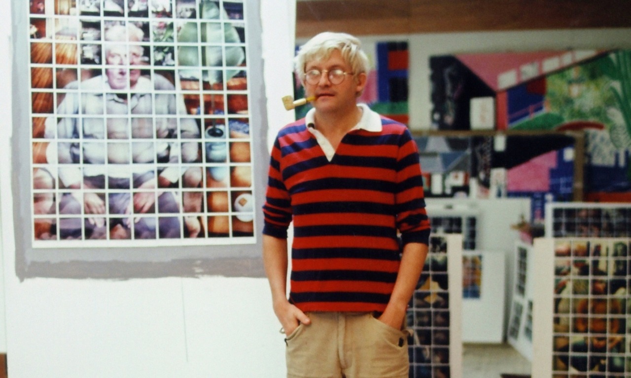
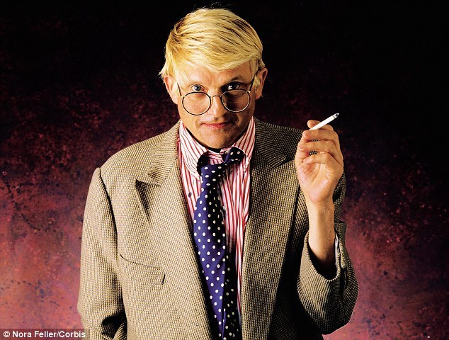
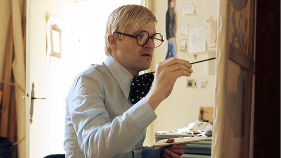
Hockney’s style, which has evolved and quieted since he made a splash on the painting scene in the 1960s, complements his work—bold color, fearless pattern, and a purposeful ignorance of rules. Hockney was mixing athletic wear (sweatshirts, beat up sneakers) with his tailoring decades before that was a menswear cliche, and has been a staunch advocate of the knit tie and colorful socks, sometimes matched, sometimes not. His mop of bleached hair and heavy eyeglass frames were eccentric and interesting back when it was still possible to be eccentric.
I know I’m an advocate for the boring, the controlled, the tried and true. I have ranked the colors and red, gold, and purple are not in my top 10. But I envy the painter’s eye Hockney brings to his wardrobe, where deliberate flattery of your best features is tossed out in favor of piling boldness on top of boldness. Typical men’s style advice recommends wearing one bold piece and toning it down with subdued complements, and a general wariness of over accessorizing, and Hockney regularly ignores both to great effect.
So you shouldn’t dress like David Hockney, as in wear what he wears (although truthfully a rugby shirt, fatigues, and plimsolls is a solid outfit) but maybe consider dressing like David Hockney, as in taking chances with colors, patterns, and shapes that aren’t obvious fits with one another.