Most of the tie/shirt/jacket combinations that appeal to me make use of strong contrast–in texture and color. Look at the exemplars of good taste highlighted here at PTO, and you’ll see a lot of contrast. For good reason: dark tie, light shirt, dark suit is pretty much the basis of modern businesswear. You can add more patterns to the shirt or suit but even the horse-blanket-iest tweed probably looks best with a light blue or ecru shirt and a dark tie (also the reason that light-colored ties are the least versatile). Such combinations are unobtrusive and flattering to most men.
On the other hand, you won’t see a lot of dark dress shirts and dyed-to-match combinations (i.e., the 2000s scourge of the Regis) in Apparel Arts, etc. (Outliers: white tie formalwear, and the Duke of Windsor, who allegedly wore gray shirts, although in some of these old photos it can be hard to tell how true the colors are.) It’s the shortcut of the schlubby dresser: “Pick one color, find two shades. There’s your outfit.” The 2014 Oscars also reminded me of the unfortunate existence of the black formal shirt. Although nontailored clothing has a wider contrast allowance, we still haven’t improved a whole lot on the dark leather jacket, white tshirt, and jeans.
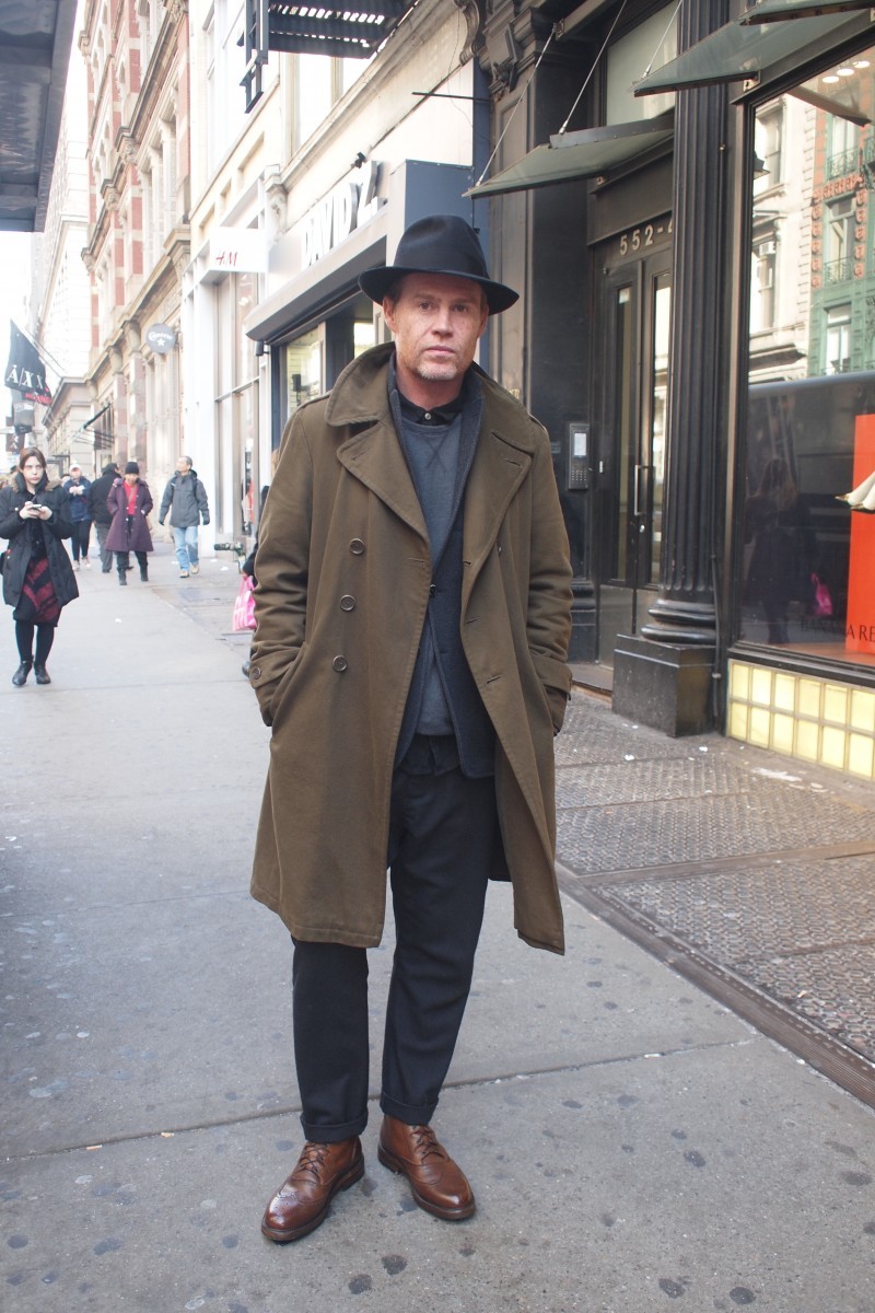
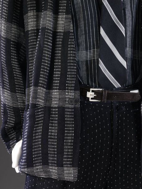
All that said, dressing tonally, but with intention, is beginning to seem interesting again. Seen above are two good examples of tonally matched clothing: Above left is stylist Allan Kennedy, shot by Mister Mort in New York, and on the right a 1986 Versace ensemble in the V&A museum, with a lot of texture and pattern variation but not much contrast. Kennedy wears some pretty traditional shapes, but everything is on the dark side of middle gray, and I think I see navy and black, but with brown shoes, an unusual combo for the kind of guy who wears pebble grain brogue boots. He’s wearing little of what we consider complementary colors (I wouldn’t even know where to place most of what he’s wearing on a color wheel).
The Versace clothing, what we can see of it anyway, looks very much of its time, but I see some resemblance to Japanese textiles I like more and more. The subtle blue and green-blue shades of those fabrics don’t, to me, need other tones to break them up. Taking a broader view of the currents of men’s clothing, I’ll be the first to admit that designer stuff is not my baliwick, but it’s hard to deny the vision of a guy like Rick Owens, who’s made a career on tonal palettes that vary all the way from dust to stone to sand.
Dressing consistently in this way is more difficult than it may sound–certainly not all hues are equal. Wearing “all black” for example involves choosing shades of black, which can in fact clash. But I’m going to pay more attention to how the grays, indigos, and olives in my closet work together or don’t, and try more tonal dressing.
-Pete