I get a million press releases a day, half of which go something like this: some upstart is selling luxury products at a fraction of the price of retail by going direct to the consumer. This no-frills label has stripped away the mumbo jumbo of traditional business models and design, paring everything down to a simple and straightforward customer experience. Free shipping, 7-day trials, free returns. Products that won’t clutter your already-cluttered life, even if it’s still just another object.
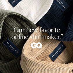
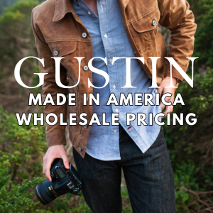
To be sure, sometimes these pitches are meaningful (I think our former advertiser Gustin genuinely offers lower prices by cutting out traditional retail channels, particularly with their jeans). But more often than not, these pitches are repackaging the same story. Minimalism is more en vogue than ever, from lifestyle to aesthetic.
Racked has an amusing story today about how all these brands are united by their love for san-serif fonts, which plugs in well with how companies are trying to carve a niche for themselves in a crowded marketplace. As graphic designer Parker notes, today’s minimalism is more playful and human – distinct from previous eras, such as the seriousness of Swiss design and ‘90s Helmut Lang. It’s more like Apple, in that sense, which has helped us equate “sparseness and flatness” with “fresh and new.”
An excerpt from the article:
If there is one style of corporate branding that defines the 2010s, it is this: sans-serif lettering, neatly presented in black, white, and ultra-flat colors. Cobalt, for example. Its goal is noise reduction, accomplished by banishing gradients, funky fonts, and drop shadows, and by relegating all-caps to little “BUY” buttons. The abundance of white space around words, photos, and playful doodles exudes a friendly calm. You’ll find the information you need in seconds, and what a pleasing few seconds they will be.
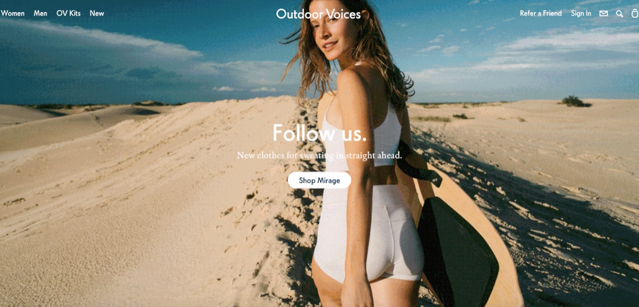
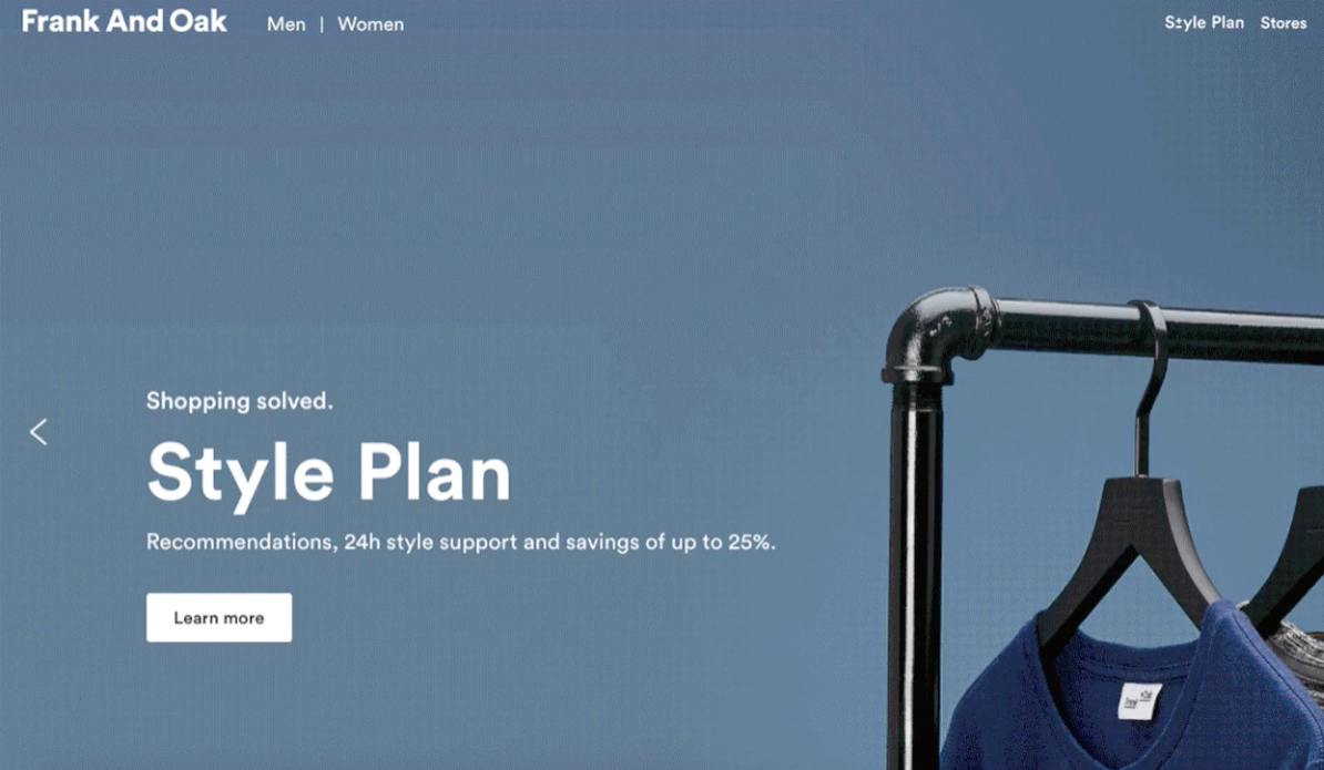
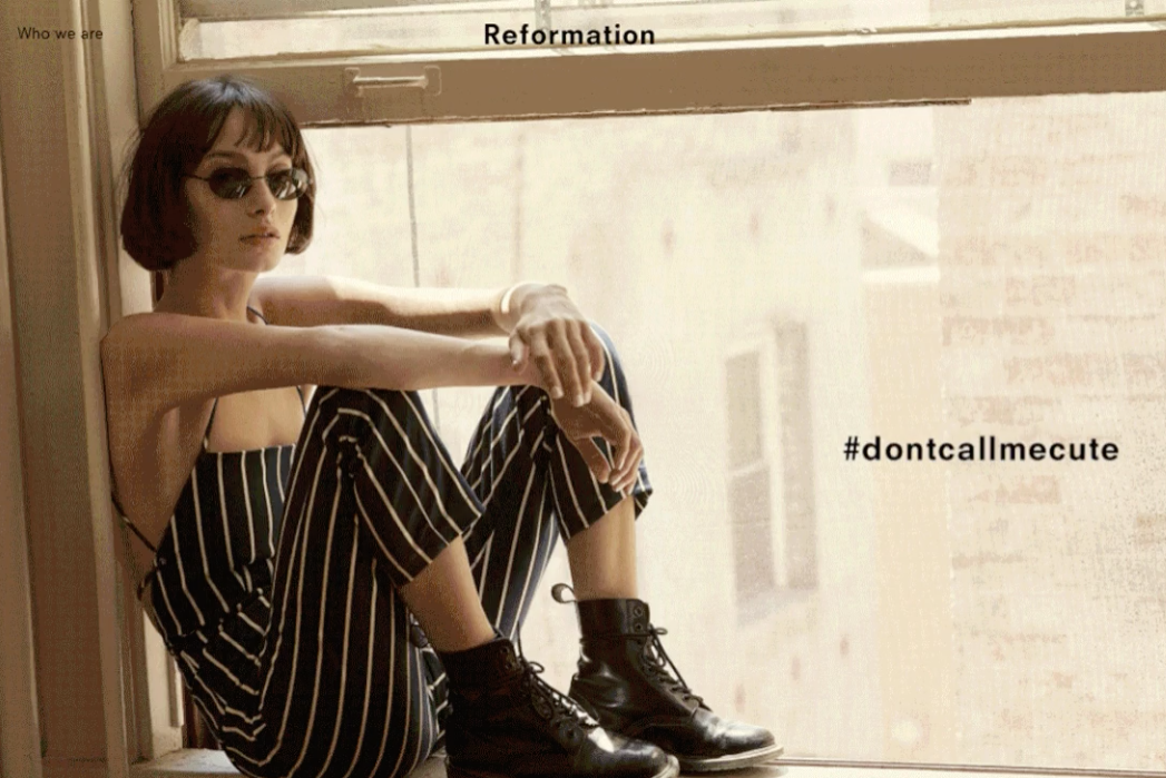
Sans-serif typefaces have been in circulation since at least the 18th century. (Serifs are the little lines that decorate the ends of letters in fonts like the one you’re reading right now. Sans serifs omit them.) Minimalist design in marketing isn’t new either, but this genre of branding has become especially, almost predictably, concentrated among venture-backed lifestyle startups like Outdoor Voices, Bonobos, Frank And Oak, Lyst, AYR, Reformation, Glossier, Allbirds, and Thinx. Some use it for nearly everything on their websites but the logo, and some use it for nearly everything, including the logo.
One of the remarkable features of startup minimalism is its flexibility. It can sell anything.
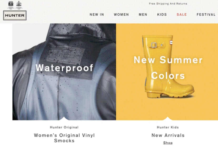
At a new Brooklyn bookstore called Books Are Magic, it sells books. At the Brooklyn Bread Lab, a bakery tucked into a row of warehouses on a litter-strewn street in Bushwick, it sells bread. Versions of startup minimalism appear on the covers of cookbooks like Everything I Want to Eat: Sqirl and the New California Cooking and Salad for President, and in the pages of Rosé All Day: The Essential Guide to Your New Favorite Wine. When Airbnb rebranded in 2014, it replaced its bubbly, three-dimensional novelty script with a lowercase, sans-serif logo rendered in white and coral. The British rain boot company Hunter, which was founded in 1856, has its classic logo at the top of its website, followed by a wave of sans serifs encouraging us to shop “new colors” and “Slide Through Summer” (by purchasing plastic slides).
Rather than being descriptive of the product itself, startup minimalism indicates how that product will be purchased and delivered to the shopper: digitally, easily, inexpensively, and with a smile. It promises no bullshit and no imposition on your busy schedule.
[…]
Uncluttered design felt fresh and new a few years ago, but there will come a point when it no longer has the same specialness. Eventually, all that delicious, soothing nothing will just look like nothing. Brands will either have to undergo Airbnb-grade makeovers, or update aspects of their look.
“Design is a pendulum. I think there will be a shift to more ornate and maximalist design,” says Ferreyros. “I could see us experimenting with that in one off projects, like stickers or a line of graphic tees, and then being able to keep the foundation of our brand clean and modern and simple.”